Data Strategy - Survey Monkey and Power BI
by Joshua Coda, Founder / CEO
1. Introduction
Working with survey data often involves intricate manipulation of the dataset to create meaningful visualizations. One common task is to unpivot columns for better interpretation in tools like Power BI. In this blog post, we'll explore the benefits of using alphanumerical codes for question categories and how to effectively unpivot columns in your dataset.

Top tip
Unpivoting columns is a useful technique for better data analysis and visualization in Power BI, especially when dealing with survey data.
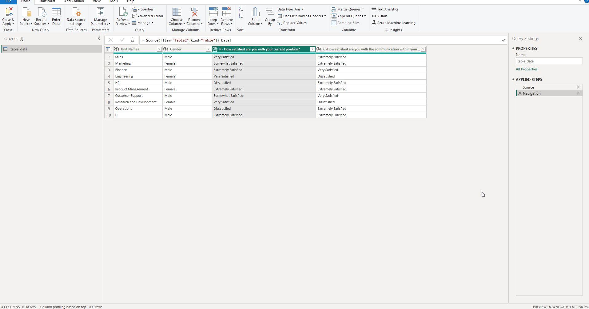
Screenshot 1: Raw Data Overview Before Adding Alphanumerical Codes
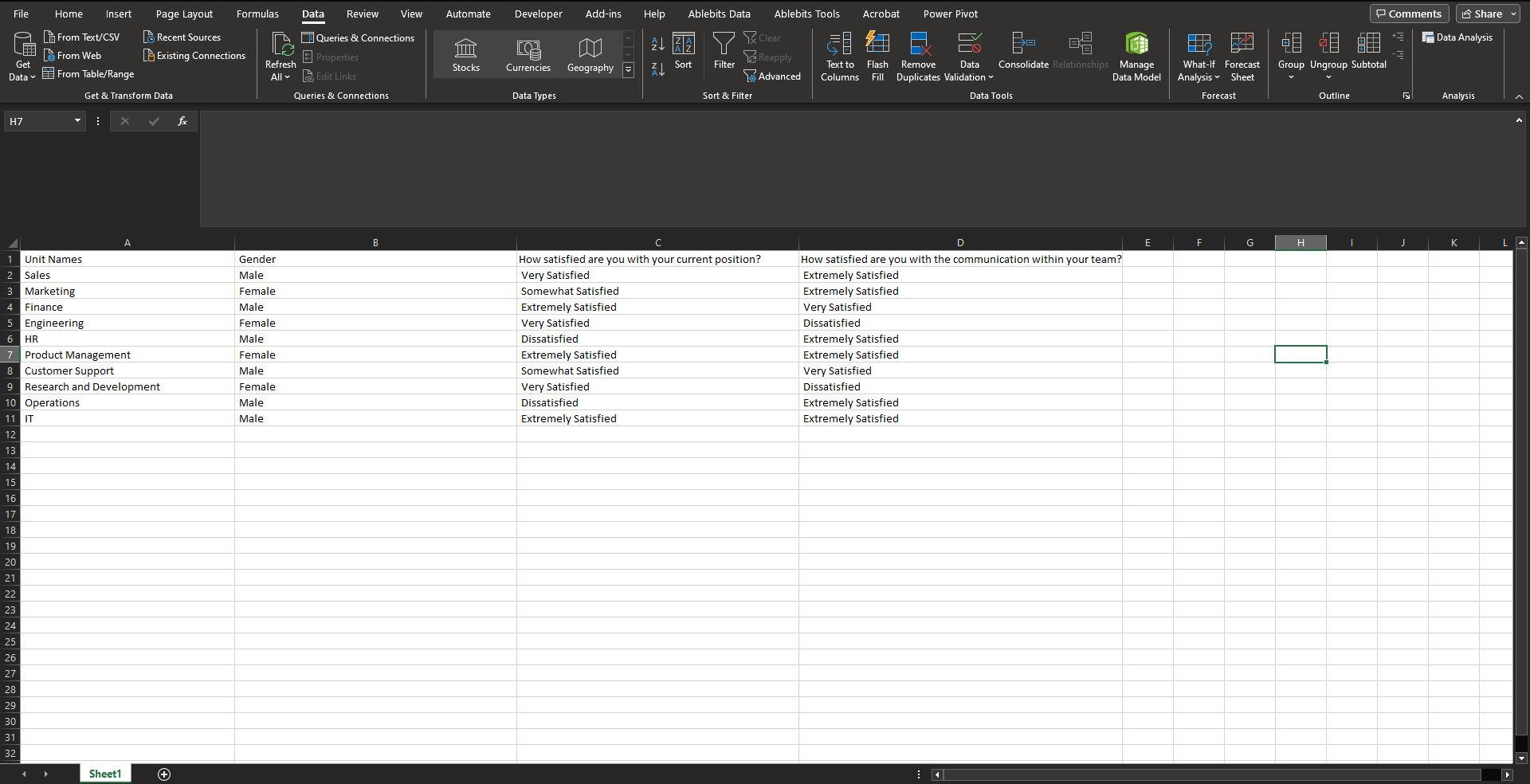
In this screenshot, you can see the raw survey data as it initially appears, before adding any alphanumerical codes for categorization.
This screenshot provides a glimpse into the survey data in its most basic form. At this point, the column headers likely use the full text of each question, making the dataset hard to manage and manipulate, especially for visualization tasks in Power BI. Each row in the dataset represents a unique respondent, and the columns contain their respective answers.
Key Takeaways
- The dataset includes multiple columns with descriptive headers.
- Each row represents individual survey responses.
- The absence of alphanumerical codes indicates that the dataset is still in its raw form and needs to be structured for effective analysis.
Understanding the initial state of your data is crucial for planning the necessary steps for effective manipulation and visualization. The next part of this blog will guide you through adding alphanumerical codes to better organize the dataset.
Screenshot 2: Navigating to Unpivot in Power Query Editor
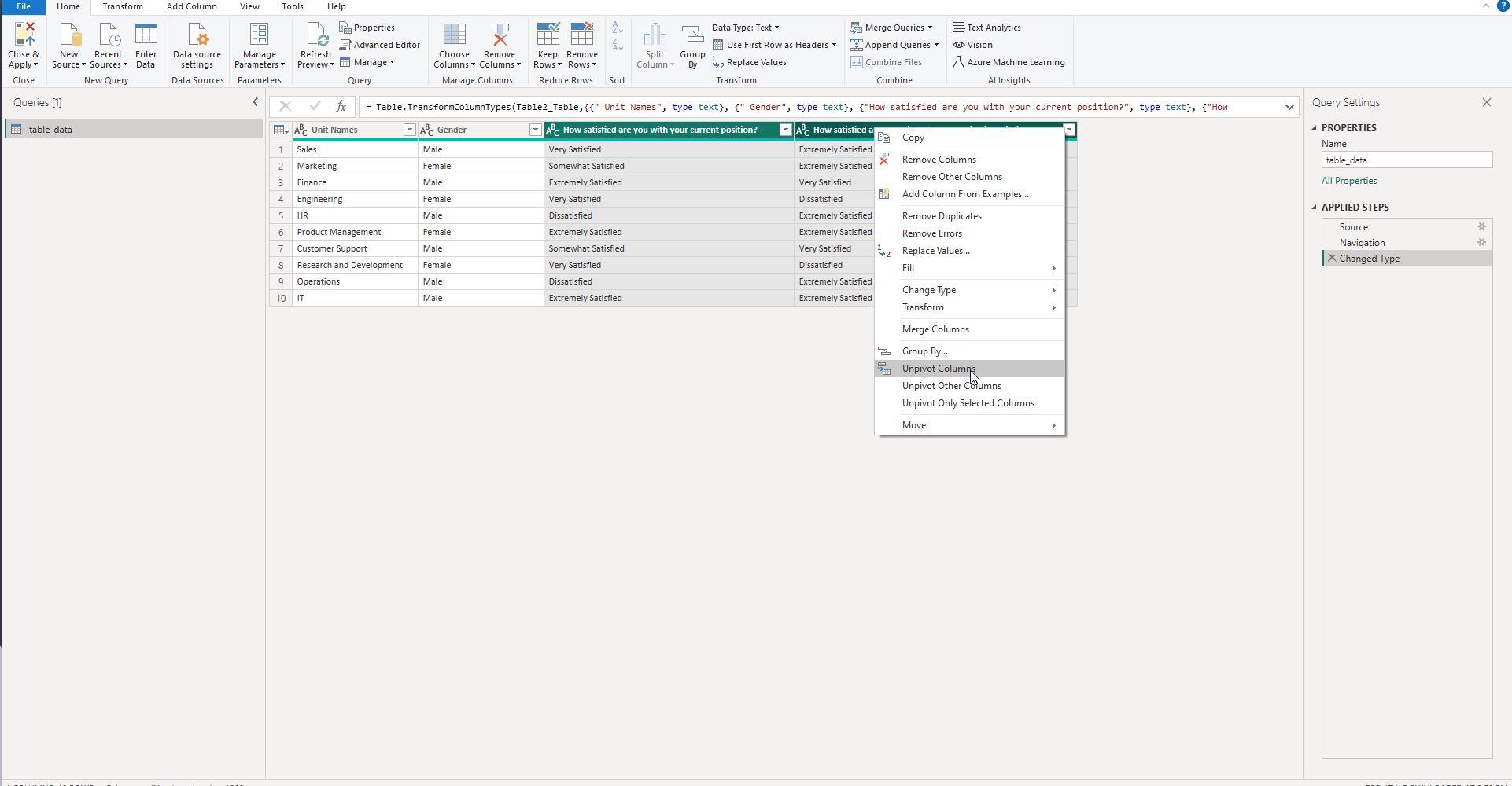
This screenshot shows the selection of columns that need to be unpivoted, directly from the Power Query Editor.
In this stage, we've navigated to the Power Query Editor in Power BI. This screenshot shows how to highlight the columns you intend to unpivot. Typically, these would be the columns containing the survey questions.
Key Takeaways
- Power Query Editor is your go-to tool for data manipulation in Power BI.
- You should highlight the columns you wish to unpivot.
- Confirm that you've selected the correct columns before proceeding to the next step.
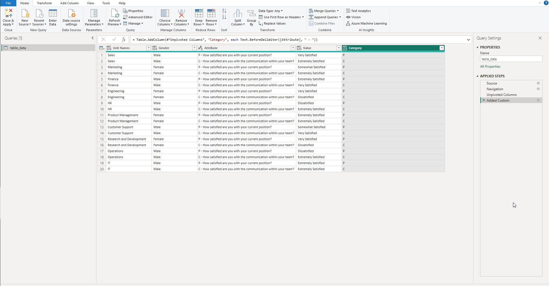
Screenshot 3: Result After Unpivoting
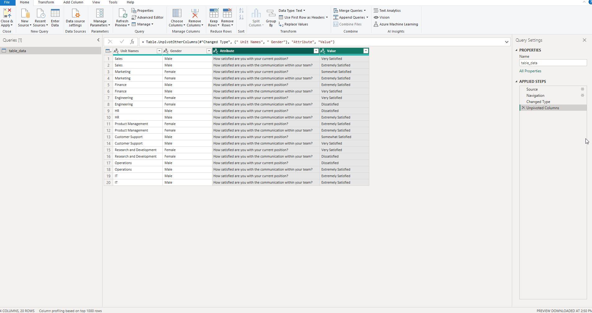
The screenshot demonstrates how the selected columns are transformed into two new columns—'Attribute' and 'Value'—after unpivoting.
Once you've selected the columns and clicked 'Unpivot Columns,' your data will restructure itself. This screenshot shows the immediate aftermath: the formation of two new columns labeled 'Attribute' and 'Value.'
Key Takeaways
- The original columns are now combined into 'Attribute' and 'Value.'
- Each 'Attribute' corresponds to the original column header, and each 'Value' corresponds to the individual survey responses.
- The dataset is now in a more structured format, suitable for advanced data manipulation and visualization.
By understanding how to unpivot columns, you've laid the groundwork for more advanced analytics and visualizations in Power BI.
Screenshot 4: Adding Alphanumerical Identifiers to Raw Data
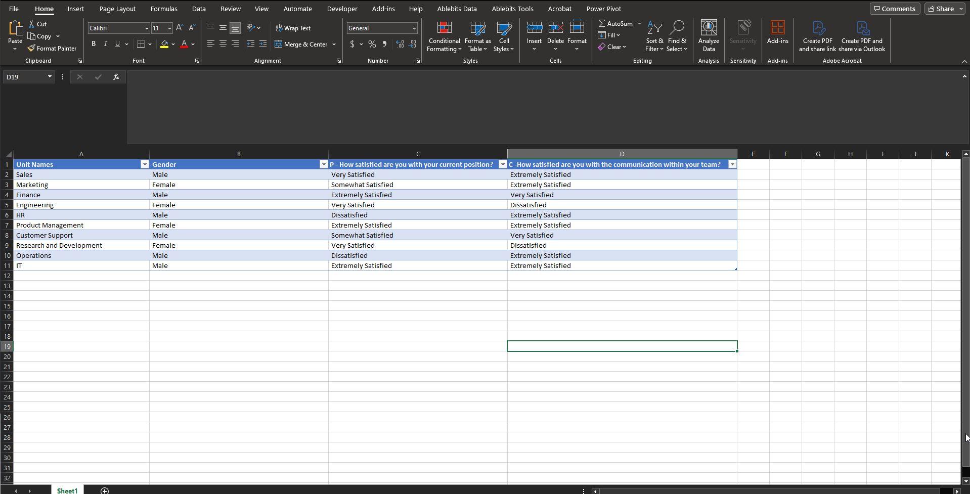
This screenshot highlights the process of adding alphanumerical codes to the column headers, transforming them from descriptive names to coded identifiers.
Once the data is unpivoted, the next logical step is to add alphanumerical identifiers to your column headers. The screenshot shows how you can rename your 'Attribute' column entries with alphanumerical codes like 'C' for Communication questions and 'P' for Position questions. This not only simplifies the dataset but also paves the way for easier manipulation and categorization.
Key Takeaways
- Alphanumerical codes offer a concise way to identify and categorize questions.
- Renaming the 'Attribute' entries is a straightforward process in the Power Query Editor.
- With coded identifiers, the dataset is easier to navigate and analyze.
Adding alphanumerical codes is an essential step for structuring your survey data effectively. These codes make it simpler to create robust visualizations and conduct in-depth analysis in Power BI.
Screenshot 5: Creating a New Column with Text.BeforeDelimiter
This screenshot shows the creation of a new column using the Text.BeforeDelimiter([Attribute], " - ") function to isolate specific parts of the 'Attribute' entries.
In some cases, you might need to extract specific information from a column for better categorization or analysis. This screenshot illustrates how to use the Text.BeforeDelimiter([Attribute], " - ") function in Power Query to create a new column that isolates the relevant portion of the 'Attribute' entries.
Key Takeaways
- The
Text.BeforeDelimiterfunction is an excellent tool for parsing text fields and creating new columns based on specific delimiters. - This function takes the 'Attribute' column and isolates the text before the " - " delimiter, placing it in a new column.
- Creating such a column can be instrumental for advanced data manipulation and visualization techniques in Power BI.
By utilizing Power Query functions like Text.BeforeDelimiter, you can further refine your dataset to better meet your analytics and visualization goals.
Text.BeforeDelimiter([Attribute], " - ")
Screenshot 6 & 7: Replacing Values in Power Query for 'P' and 'C'
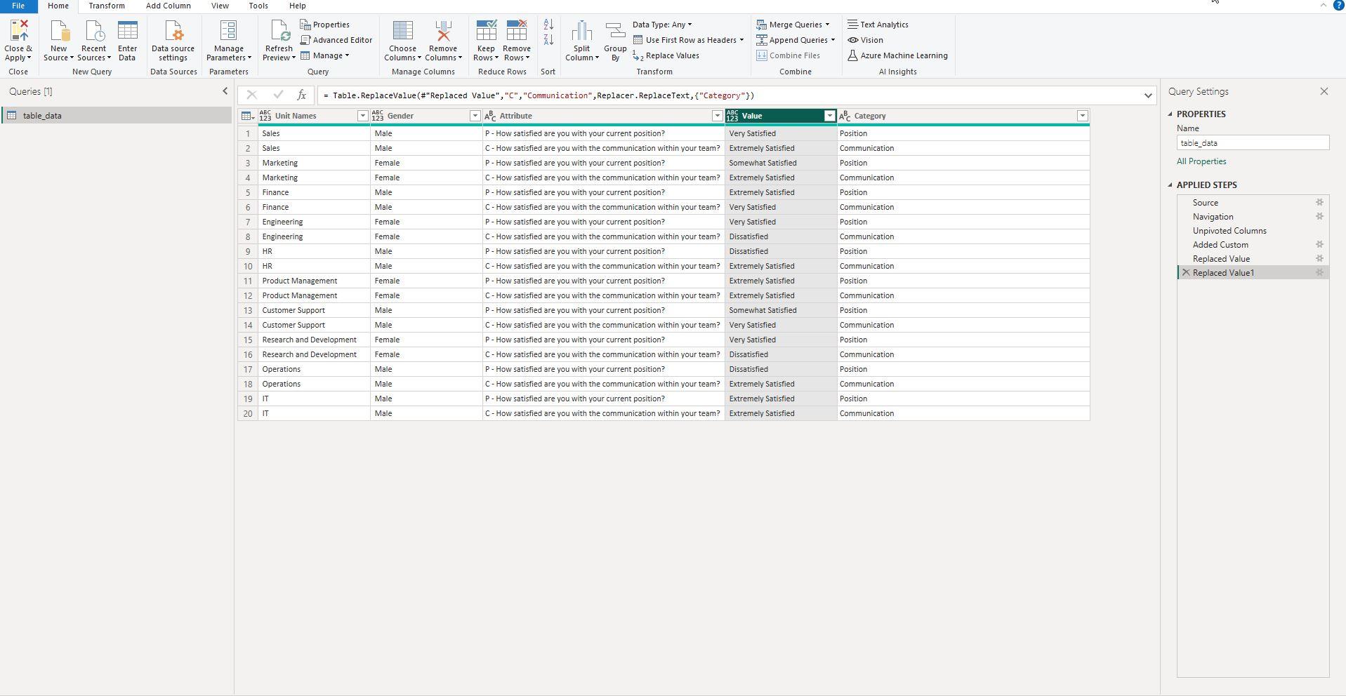
This screenshot displays the step of replacing values in the 'Attribute' column with alphanumerical codes 'P' and 'C' for Position and Communication, respectively.
After adding alphanumerical identifiers, the next step is to replace the existing 'Attribute' values with these new codes. This screenshot illustrates how you can use Power Query's 'Replace Values' feature to swap out the descriptive text with the concise 'P' and 'C' identifiers.
Key Takeaways
- The 'Replace Values' feature in Power Query is a powerful tool for mass-replacing text.
- Replacing values with 'P' and 'C' simplifies your dataset and aids in quick identification of question categories.
- This process is crucial for efficient data manipulation and visualization in Power BI.
Utilizing Power Query's 'Replace Values' feature allows for easy and quick categorization, laying a solid foundation for future data analysis and visualization tasks in Power BI.
Screenshot 8: Creating the "Likert" Column Using If Conditions
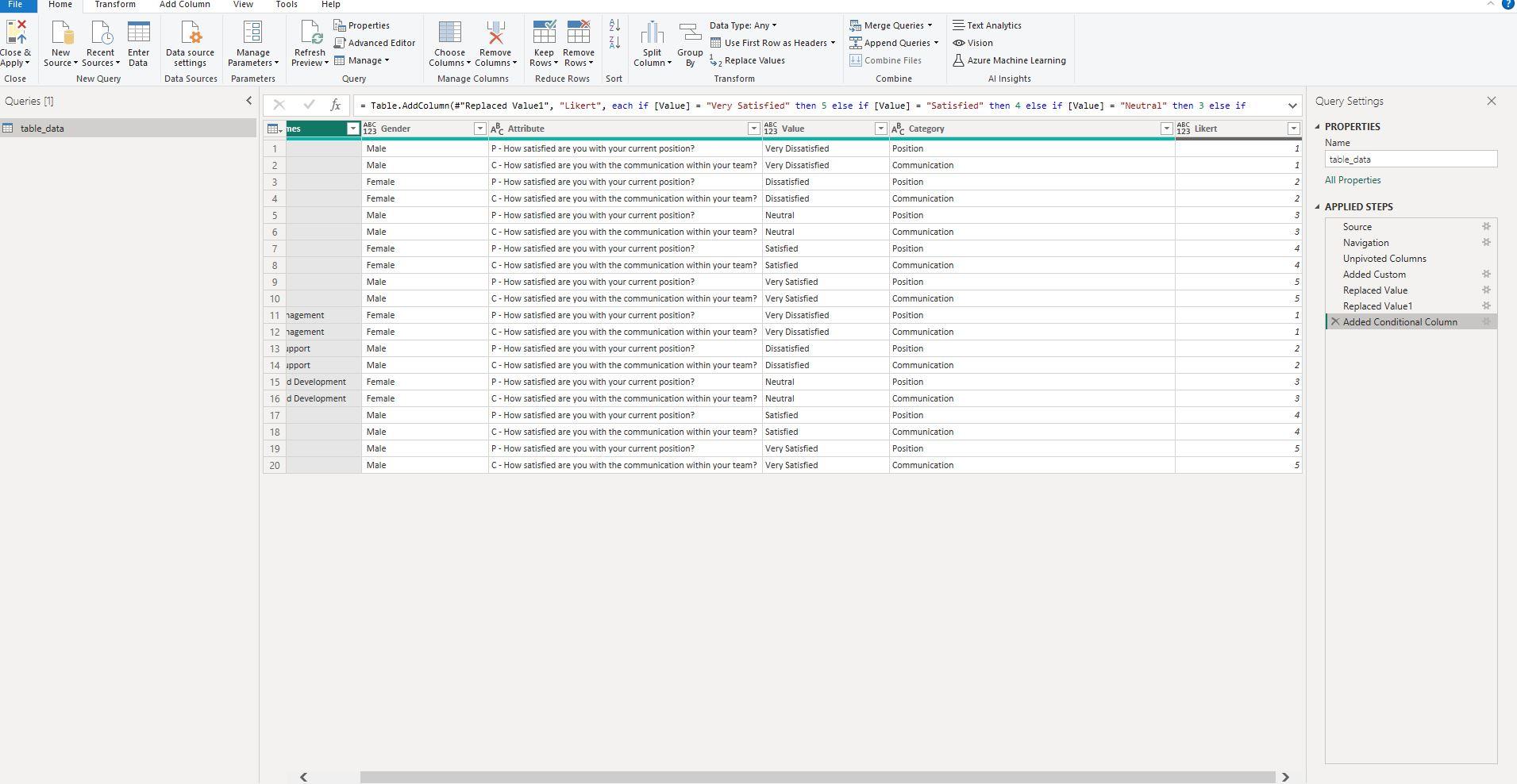
This screenshot showcases how to create a new column named 'Likert,' converting Likert scale responses to numeric values using if conditions.
After you've refined your dataset with necessary columns and codes, you might need to translate qualitative Likert scale responses to quantitative numeric values. This is precisely what the screenshot shows: creating a new column called 'Likert' that uses if conditions in Power Query to convert Likert scale answers into numbers suitable for analysis.
Key Takeaways
- Converting Likert scale to numeric values enables quantitative analysis and more precise visualizations.
- The 'Likert' column is created using if conditions within Power Query.
- This step adds another layer of refinement to your dataset, making it even more tailored for your specific analytic needs.
Implementing if conditions to create a 'Likert' column is an advanced but essential step for those looking to conduct in-depth analysis and create insightful visualizations in Power BI.
Screenshot 9: Final Power BI Visualization with DAX Measures
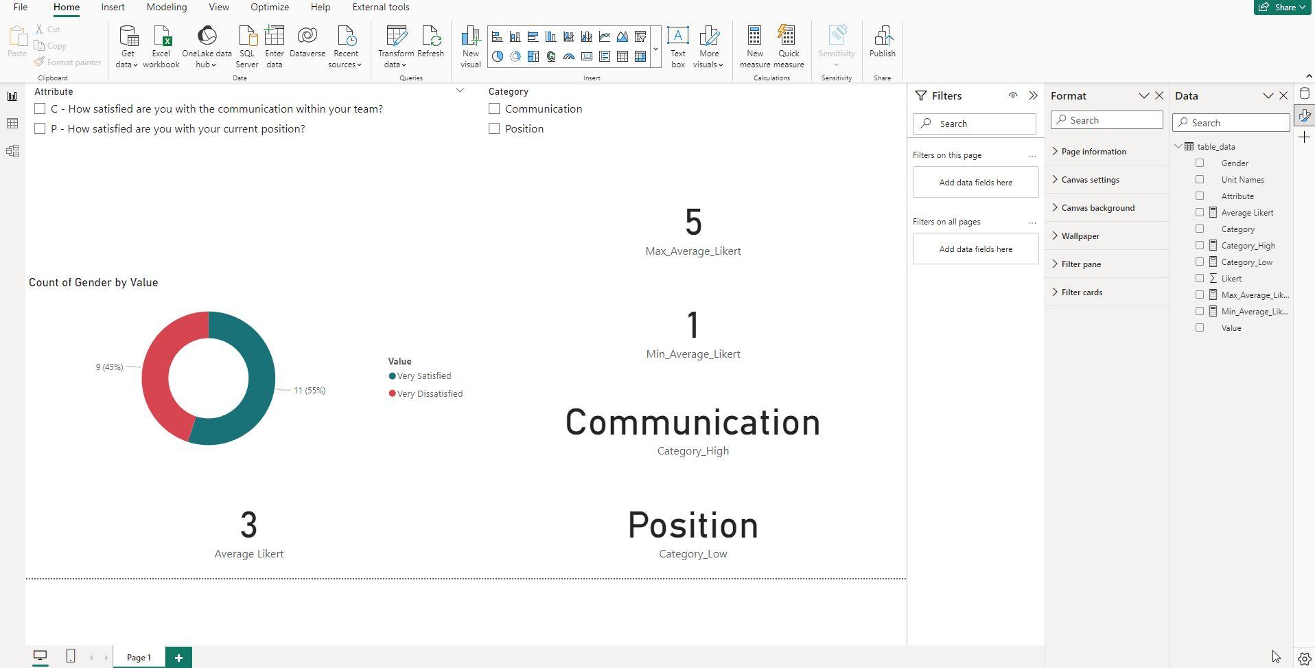
This screenshot displays the final Power BI visualization, enhanced with specific DAX measures like Average Likert, Category_High, Category_Low, Max_Average_Likert, and Min_Average_Likert.
The culmination of our data preparation journey leads us to this final Power BI visualization. Here, several DAX measures are employed to glean meaningful insights from the survey data. These measures allow us to calculate the average Likert scores, identify categories with the highest and lowest averages, and much more.
Key Takeaways
- The DAX measures bring depth and flexibility to our Power BI visualization.
Average Likertcalculates the average score for each category, whileCategory_HighandCategory_Lowidentify the highest and lowest scoring categories, respectively.- The measures
Max_Average_LikertandMin_Average_Likerthelp us find the extreme values of the average Likert scores across all selected categories.
By using these DAX measures, you can make your Power BI visualizations more dynamic and informative, ensuring that your data tells a complete story.
DAX Measures Used
Average Likert = AVERAGE('table_data'[questions.Likert])

Category_High =
CONCATENATEX(
    FILTER(
        VALUES('table_data'[Category]),
        [Average Likert] = [Max_Average_Likert]
    ),
    'table_data'[Category],
    ", "
)

Category_Low =
CONCATENATEX(
    FILTER(
        VALUES('table_data'[Category]),
        [Average Likert] = [Min_Average_Likert]
    ),
    'table_data'[Category],
    ", "
)

Max_Average_Likert =
MAXX(
    ALLSELECTED('table_data'[Category]),
    [Average Likert]
)

Min_Average_Likert =
MINX(
    ALLSELECTED('table_data'[Category]),
    [Average Likert]
)
Conclusion
Navigating survey data can be a daunting task, especially when it comes to transforming and visualizing it. However, Power BI, supplemented with Power Query and DAX measures, offers a robust toolkit to simplify and enhance this process. From unpivoting columns to categorizing questions with alphanumerical codes, and finally to employing complex DAX measures, each step brings us closer to making the most out of our survey data.
By following the guidelines and examples outlined in this post, you'll be well-equipped to turn even the most cumbersome datasets into insightful, compelling visualizations.